
Scatter graphics: League 1, 29 Oct 2017
Here’s another update to the scatter graphics, which compare the attacking and defensive performances of every team in a division. Each of the four graphics is explained briefly below and at length here.
Shot dominance
First of all, here is how the number of shots taken by each club compares with those they face in return. The average number of shots taken per match is on the horizontal and the average number faced is on the vertical, so bottom right (take plenty, allow few in return) is good while top left (take few, allow plenty) is bad. The stripes are like contours: the greener the stripe, the better the performance (and vice versa for red).

Wigan continue to be the most dominant team in the division by far, with only Peterborough taking more shots per match and nobody allowing fewer in return. However both Doncaster and Portsmouth can rival their defensive miserliness and Bristol Rovers are creating a similar volume of chances.
Three of the current bottom four – Plymouth, Gillingham and Northampton – are lodged in the undesirable top left corner, while Bury are a bit more confusing as they haven’t looked all that bad.
Wimbledon and Fleetwood games have been low on action so far, with an average of around 20 shots taken at both ends combined, compared to over 29 at Peterborough.
Attacking effectiveness
Now let’s look at attacking alone. The horizontal axis stays the same as in the graphic above, but now the vertical shows the average number of shots needed to score each league goal. Therefore bottom right is good (taking lots of shots and needing fewer efforts to convert) and top left is bad:

Wimbledon have had a horrible time in front of goal this season, and it’s not exactly been a picnic for Gillingham either, with both having needed over twice as many attempts to score each goal as the average team so far.
Meanwhile Fleetwood have created even fewer opportunities – only Northampton have troubled opposing defences less frequently – but have been impressively ruthless at finding the net. The Cod Army have scored more goals than Charlton despite taking almost six fewer shots per match on average.
Defensive effectiveness
Next let’s look at the defensive situation – basically take the above chart and replace the word “taken” for “faced” on both axes. Now top left is good – facing fewer shots and able to soak up more per goal conceded – and bottom right is bad:

Scunthorpe, Shrewsbury and Blackburn have all soaked up an impressive number of chances for each goal conceded, while Gillingham would be in a worse predicament still if the huge number of shots they’ve been allowing were going in at an average rate.
Oldham‘s problems – at least prior to their Richie Wellens-inspired revival – seem to be mostly in defence, where they’ve leaked goals at a worrying rate. Bristol Rovers have also suffered defensively, with their strong attack undermined by a porous back line.
Expected goals
Finally here’s an attempt at correcting the first graphic for the quality of chances created and allowed, using the same “expected goals” values that power my shot timelines (explained here). The reason for doing this is that the results tend to correlate more strongly with performance than when we treat all shots equally:
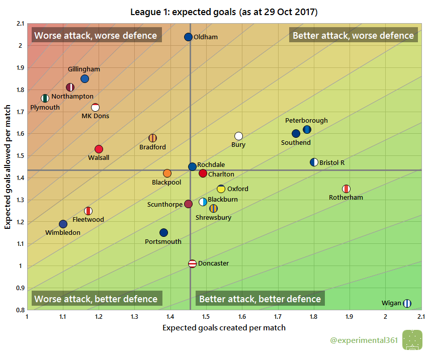
When we correct for chance quality Wigan look even more impressive, with their attack creating more than twice what they’ve allowed their opponents to carve out.
The attacks of four other clubs – Peterborough, Southend, Bristol Rovers and Rotherham – are performing nearly as well, although all except the Millers look below-average defensively.
Doncaster s performances suggest that they’re capable of sitting far higher in the table, with a decent attack and one of the best defences in the division.
MK Dons are having an awful season so far and could easily get sucked into a relegation battle, particularly if the likes of Bury and Wimbledon can turn their respectable overall performances into results.

You must be logged in to post a comment.