
League 1 timelines, 10 Feb 2018
A quick explanation
You can skip this if you’ve seen these before.
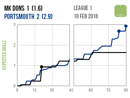
As usual, here are timeline graphics for the latest round of matches. There’s a full explanation of these here, but in a nutshell they track how each club’s expected goals tally (the number of goals that the average team would have scored
from the chances that they created) increased over the course of the match.
This allows us to get a better sense of how each game played out than from just watching the highlights. Every jump in a line is a shot, with bigger jumps corresponding to more promising chances (at least as far as I can tell from the limited data available at this level).
There are two numbers next to each club’s name: the first is how many goals they scored and the second (in brackets) is how many goals the average club would have scored from their shots. The latter number is what the lines track, with dots on the lines denoting the goals they actually scored.
Individual matches
Blackburn made a successful late comeback at home to Oldham and kept on pushing for a winner until the final whistle, although mostly from poor positions. Southend looked impressive in a surprisingly comfortable win over Wigan, as did Plymouth in dispatching Shrewsbury. A mention should also go to Bristol Rovers for their convincing victory at Oxford.


There was also one midweek match:


You must be logged in to post a comment.