Scatter graphics: Premier League, 2018/19
Now that the regular season is over, here’s a final batch of the scatter graphics, which compare the attacking and defensive performances of every team in a division. Each of the four graphics is explained briefly below and at length here.
Shot dominance
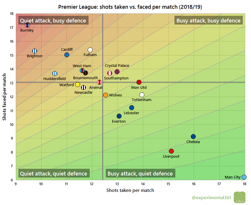
First of all, here is how the number of shots taken by each club compares with those they face in return. The average number of shots taken per match is on the horizontal and the average number faced is on the vertical, so bottom right (take plenty, allow few in return) is good while top left (take few, allow plenty) is bad. The stripes are like contours: the greener the stripe, the better the performance (and vice versa for red).
Champions Man City were the most dominant side overall, but Liverpool and Chelsea weren’t all that far behind. Interestingly Everton and Leicester are up with Tottenham as the next most dominant, with Man Utd and Arsenal lagging. Burnley stood out as the side who spent the most time on the back foot.
Attacking effectiveness
Now let’s look at attacking alone. The horizontal axis stays the same as in the graphic above, but now the vertical shows the average number of shots needed to score each league goal. Therefore bottom right is good (taking lots of shots and needing fewer efforts to convert) and top left is bad:
Huddersfield‘s relegation is no mystery with an attacking record like that: they were pretty much twice as wasteful in front of goal as the average team. Poor finishing looks to have cost all three relegated teams this season. Arsenal may have looked fairly average in the first chart but they remained in contention for European football by being the division’s sharpest finishers. Burnley were also able to rely on their strikers finding the net despite not giving them much ammunition.
Defensive effectiveness
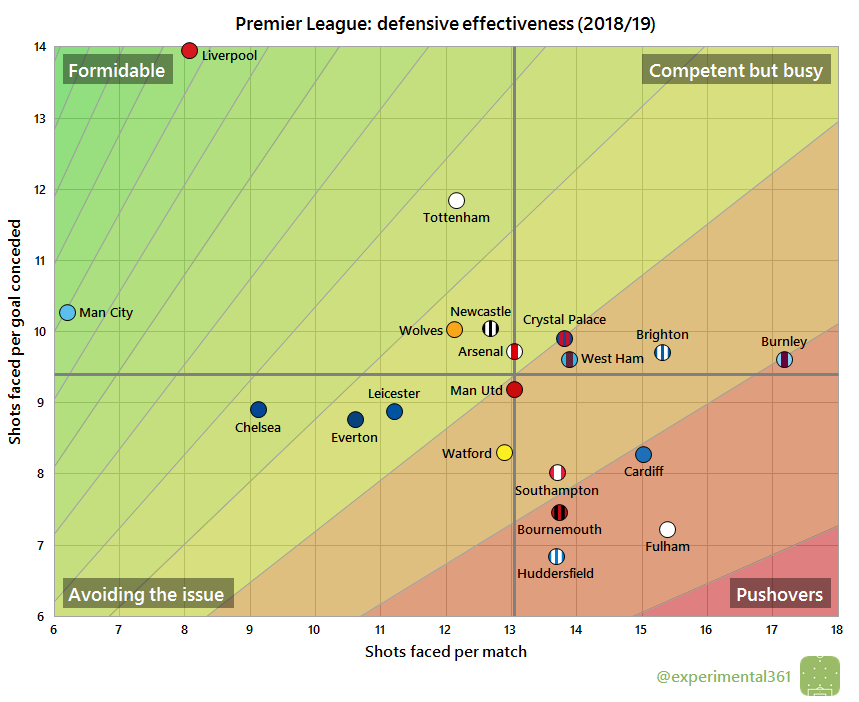
Next let’s look at the defensive situation – basically take the above chart and replace the word “taken” for “faced” on both axes. Now top left is good – facing fewer shots and able to soak up more per goal conceded – and bottom right is bad:
Liverpool‘s defence was by far the toughest to break down, although Tottenham also deserve a mention for how difficult they made it for opponents to score. If it wasn’t bad enough seeing Huddersfield as the most wasteful finishers on the previous chart, here they’re revealed as having the most porous defence as well.
Expected goals
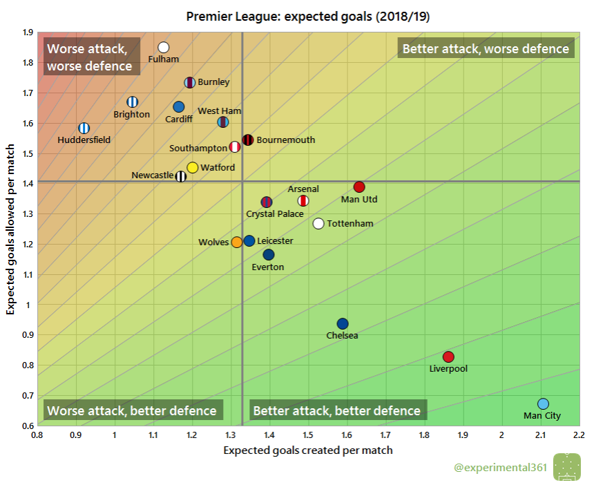
Finally here’s an attempt at correcting the first graphic for the quality of chances created and allowed, using the same “expected goals” values that power my shot timelines (explained here). The reason for doing this is that the results tend to correlate more strongly with performance than when we treat all shots equally:
When we adjust for shot quality, Liverpool pull ahead of Chelsea but are still a little way short of Man City overall. Brighton look to have had a lucky escape given that they’re closer to Huddersfield and Fulham than Cardiff here. All of the ‘big six’ are now in the desirable bottom right quadrant, with Leicester and Everton still nearby and Crystal Palace also having put in some respectable performances.


You must be logged in to post a comment.